A modern camera produces files six to eight thousand pixels wide and ten to twenty-five megabytes in size. A website needs a fraction of that. Upload originals and pages crawl on mobile connections; shrink them carelessly and photos turn soft, jagged, or blotchy. Getting web images right is mostly a matter of a few decisions made in the right order, and then applied consistently to every file.
Pixels Matter, DPI Doesn’t
The most persistent myth in web imaging is that screen images should be “72 DPI.” They don’t need to be anything. DPI (more precisely, PPI) is a single number stored in the file that tells a printer how large to make the image on paper. A 1200-pixel-wide photo tagged at 72 PPI and the same photo tagged at 300 PPI are identical on a screen: same pixels, same file size, same appearance. Browsers ignore the value entirely.
What matters is pixel dimensions. When someone asks for “a 300 DPI image for the website,” what they need is the right width and height in pixels. Change the DPI field without resampling and nothing about the picture changes.
Working Out the Right Width
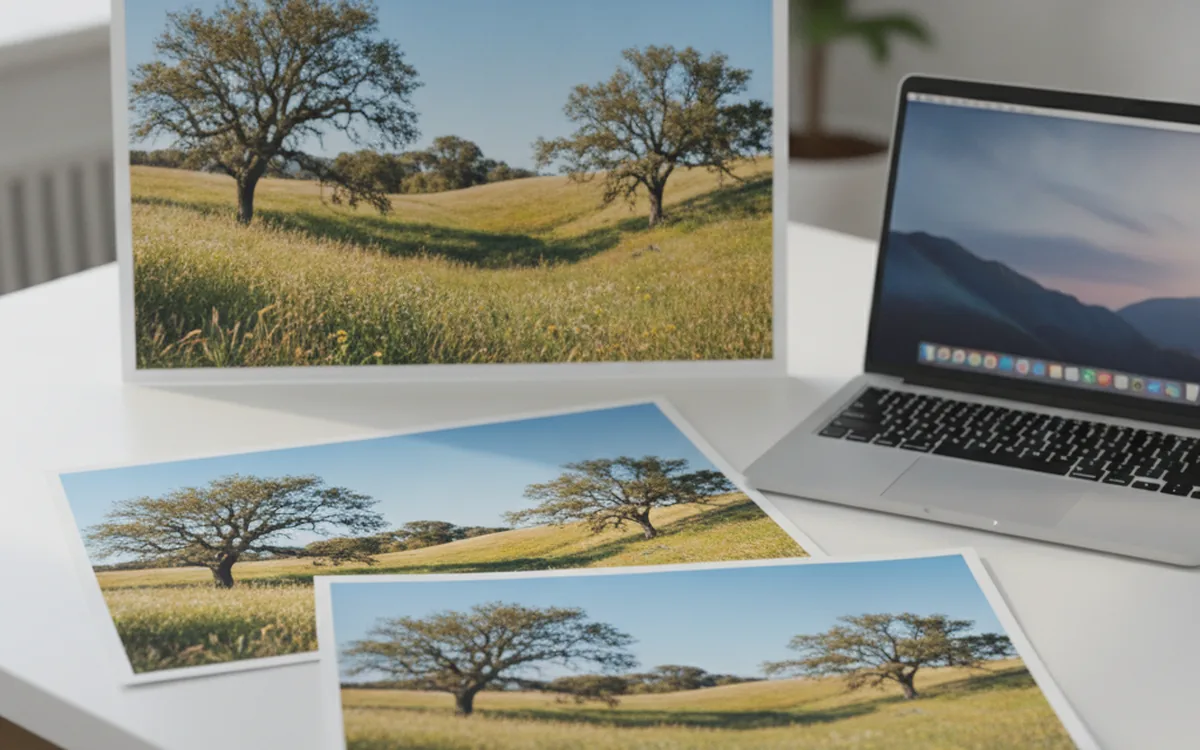
Start from the layout, not the camera. Find the widest the image will ever be displayed, in CSS pixels: a full-width hero might be 1440, a column of article text 720, a product card 360. Then account for high-density screens. Most phones and many laptops have a device pixel ratio of 2 or more, meaning a 720-pixel slot is drawn with 1440 physical pixels. An image sized exactly to the CSS width looks noticeably soft on those displays.
A practical rule: export at roughly twice the CSS display width for important images, and don’t go beyond that. Three times the width is rarely worth the extra bytes, because the difference is hard to see at normal viewing distance.
Resampling Filters: How Pixels Get Thrown Away
Downsizing means computing each new pixel from a group of old ones. The method, called the resampling filter, has a visible effect on the result.
- Nearest neighbor picks one source pixel and discards the rest. It’s fast and produces jagged edges and shimmering patterns in photos. Use it only for pixel art and screenshots of interfaces where you want hard edges at exact multiples.
- Bilinear averages nearby pixels. It’s smooth but slightly soft, and on large reductions it can let fine patterns alias into moiré.
- Bicubic uses a wider neighborhood and keeps more detail. It’s the default in many editors for good reason.
- Lanczos preserves the most fine detail and is a popular choice for downscaling photos, at the cost of occasional thin halos along high-contrast edges.
For photos, bicubic or Lanczos is the right starting point. If you see bright outlines around dark branches against a sky, step back to bicubic.
Large Reductions
Going from 7000 pixels to 700 is a tenfold reduction, and some quick resizers sample too few source pixels to represent detail properly, which shows up as moiré on fabric, brick, and screens. A good resampler accounts for the scale factor automatically. If yours doesn’t, downsizing in two or three steps, such as halving repeatedly and finishing with a single precise resize, gives cleaner results than one giant jump.
Sharpen After Resizing, Not Before
Every downsizing operation softens the image slightly, because each output pixel averages several input pixels. The fix is output sharpening: a light pass applied after the image reaches its final size.
Order is the whole point. Sharpening the full-size original and then resizing mostly averages the effect away. Sharpening at the final size targets exactly the pixels that will be shown.
Output sharpening should be subtle. An unsharp mask with a small radius, well under one pixel to around one pixel for typical web sizes, with a moderate amount, restores crispness without visible halos. Smaller images need a smaller radius. Faces and skin need less than architecture and products. If you can see the sharpening as an effect, it’s too strong.
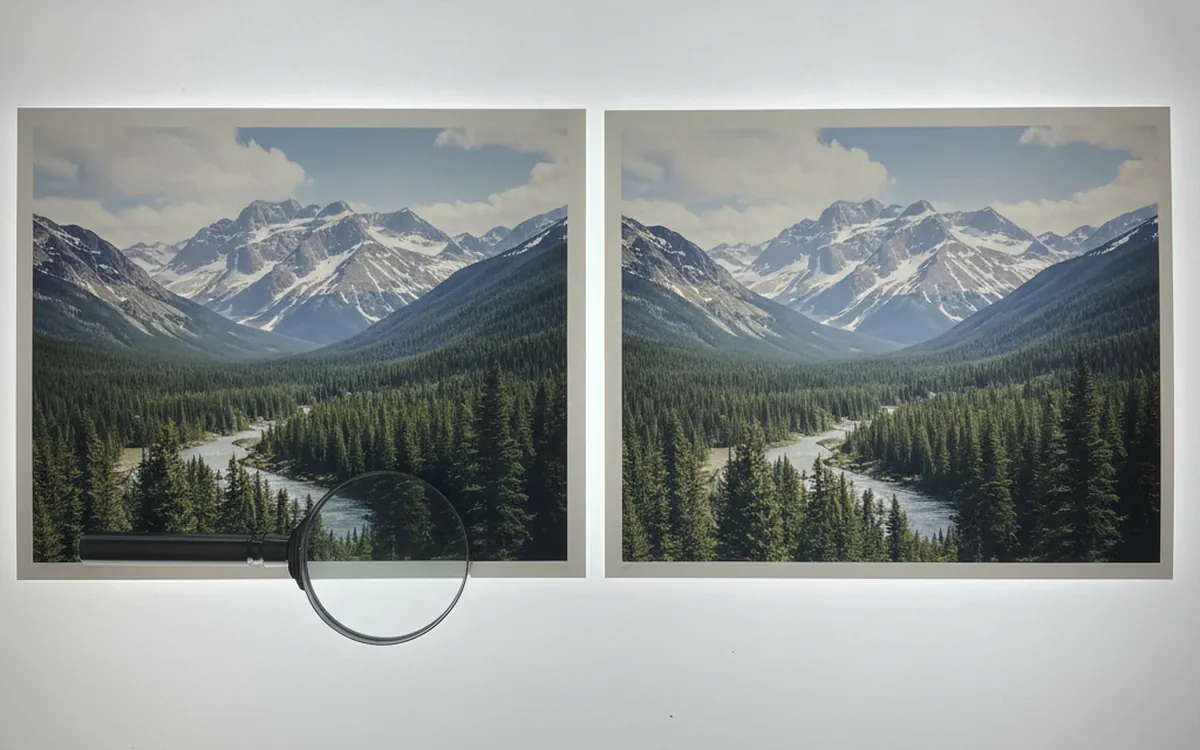
Practical tip: judge sharpening at 100% zoom on the actual output file, not in the editor’s scaled preview. Previews are resampled on the fly, so what looks crisp at “fit to screen” can be oversharpened at true size, and the reverse.
Compression: JPEG and WebP Quality
Once the dimensions are right, compression decides the file size. The quality slider is not a percentage of anything: each encoder maps the number to its own internal settings, so quality 80 in one program isn’t the same as 80 in another. Treat it as a relative dial and judge by eye.
JPEG
For photos, most encoders produce good results somewhere in the 75 to 85 range. Below that, blocky artifacts appear in smooth gradients like skies; above about 90, file sizes climb steeply for differences few people can see. A few more settings matter:
- Progressive encoding lets the image appear blurry first and sharpen as it loads, and is often slightly smaller.
- Chroma subsampling (4:2:0) halves color resolution, which is fine for photos but can smear thin red text or logos. Turn it off for graphics with sharp colored edges.
- Color space should be sRGB. Convert before saving; images in wider color spaces without proper handling look dull in some browsers.
- Metadata can be stripped for web output, which saves a few kilobytes and removes location data. Keep a copyright field if you want it.
WebP and AVIF
WebP is supported by all current major browsers and typically produces smaller files than JPEG at similar visual quality. Lossy WebP in the 75 to 80 range is a sensible starting point for photos. AVIF compresses further still, especially at low bitrates, but encodes more slowly. A common approach is to serve AVIF or WebP with a JPEG fallback, or simply WebP if you want one format to manage.
Generating Sizes for srcset
One file can’t be right for every screen. A phone in portrait needs a fraction of the pixels a 27-inch monitor does. Responsive images solve this: you export several widths of the same image and let the browser choose.
In HTML, the srcset attribute lists the available files with their pixel widths, and the sizes attribute describes how wide the image will be displayed at different viewport widths. The browser combines that with the screen’s pixel density and downloads the smallest file that will look sharp.
A typical ladder of widths for a content image might be:
- 480 pixels for small phones;
- 800 pixels for large phones and small tablets;
- 1200 pixels for tablets and laptops;
- 1600 pixels for high-density laptops;
- 2400 pixels for full-width heroes on large, sharp displays.
Name the outputs predictably, such as harbor-800w.webp and harbor-1600w.webp, so templates can build the list automatically. And always set width and height attributes on the image tag, so the browser reserves space and the page doesn’t jump as images load.
Batch Presets: Set It Up Once
Most sites need the same few outputs over and over. Instead of resizing by hand, define a preset for each destination and run every new batch through it. In PhotoBatch, that’s a short script per destination; whatever tool you use, the structure is the same:
- auto-rotate based on the EXIF Orientation tag;
- convert to sRGB;
- fit within the target width and height, without enlarging smaller originals;
- apply light output sharpening;
- save in the target format and quality, stripping unneeded metadata;
- write each size with a width suffix in the file name.
Fit vs. Crop
Decide per preset whether images should fit inside a box, keeping their proportions, or be cropped to an exact aspect ratio. Product grids and thumbnails usually need a fixed ratio so rows line up; article images usually look better uncropped. Mixing the two in one preset is a common source of awkwardly chopped heads.
Keep the originals untouched and treat web files as disposable output. When the design changes and you need a new width, you rerun the preset on the originals instead of resizing already-compressed files again.
The Bottom Line
Size web images by pixels, not DPI, at about twice their display width for sharp screens. Downsample with bicubic or Lanczos, sharpen lightly at the final size, and compress JPEG or WebP to the point where artifacts just stay out of sight. Export a ladder of widths for srcset, and capture the whole recipe in a reusable batch preset so every image on the site gets the same treatment.