When a photo mosaic disappoints, the algorithm usually gets the blame. More often the problem was settled before the first cell was matched: the library didn’t have the right colors, had too few images, or was full of near-identical shots that made the result look repetitive. A mosaic program can only choose from what you give it.
This guide is about that preparation step: collecting, cleaning, and shaping a tile library, then choosing a target image and tile size that suit the way the mosaic will be seen.
How Many Tiles You Need
Start from the grid, not the library. A mosaic with 60 columns and 80 rows has 4,800 cells. If your library has 300 images, each one appears sixteen times on average, and viewers will notice. If it has 3,000, most tiles appear once or twice, and the mosaic reads as a collection rather than a pattern.
Rules of Thumb
- A few hundred tiles is a workable minimum for a small mosaic, such as a greeting card or a social post, where nobody inspects individual tiles.
- One to three thousand tiles is comfortable for a poster-size print with a medium grid.
- A library close to the number of cells lets you limit each tile to one or two uses without sacrificing color accuracy.
Quantity is not the whole story, though. A thousand photos of the same beach at sunset behave like a much smaller library because they all sit in the same corner of the color space.
Color Variety Matters More Than Count
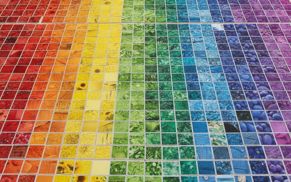
Each tile is reduced to its average color, sometimes with a few sub-regions for finer matching. The program then finds the closest tile for each cell. If the library has no tiles close to a cell’s color, it uses the nearest available one, and that’s where skin turns gray or a blue sky turns teal.
Audit Your Library
Before you build anything, sort the library by average brightness and look at both ends. Most personal photo collections are heavy in mid-tones and light on deep shadows and clean highlights. Then think about the target: a portrait needs skin tones, browns, and dark hair colors; a seascape needs a range of blues; a sunset needs warm oranges and near-black silhouettes.
Fill the Gaps
- Add photos that are naturally dark or light: night scenes, snow, overcast skies, interiors.
- Include close-ups of textures with strong color, such as foliage, brick, fabric, and painted walls.
- Use color correction sparingly. A mosaic program can tint tiles toward the cell color, but heavy tinting makes every tile look washed in the same filter.
Practical tip: build a quick test mosaic at a coarse grid before collecting more photos. The areas where the result looks wrong, such as muddy shadows or off-color skin, show you exactly which colors your library is missing.
Cropping Tiles to a Consistent Shape
Every tile has to fit the same cell shape. Most mosaics use square cells, and square tiles are the simplest to work with, but whatever shape you choose, the library needs to match it. If you leave cropping to the mosaic program, it will usually center-crop automatically, which works for landscapes and can cut heads off in group photos.
- Decide on the cell shape first. Square is the default. Use 3:2 or 4:3 only if your tiles are mostly from the same camera and you want to keep full frames.
- Crop in a batch. A PhotoBatch script can center-crop a whole folder to square and resize every tile to the same pixel size in one pass. Review the results and fix the few where the subject ended up off the edge.
- Resize to a working size. Tiles larger than the final cell only slow down processing. For most mosaics, 200 to 400 pixels on a side is plenty; go larger only if the final cell size in pixels is bigger.
- Keep originals separate. Write cropped tiles to their own folder so you can re-crop later for a different cell shape.
Avoiding Repeats
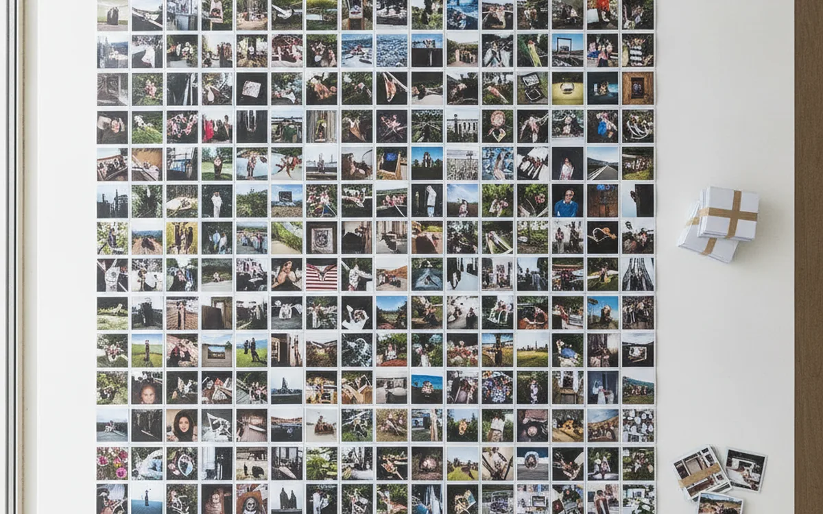
Repeated tiles are the most visible flaw in a mosaic. The eye finds identical images easily, especially when they sit near each other in a smooth area like a wall or a sky.
Clean Out Near-Duplicates
Personal libraries are full of bursts and retakes: ten frames of the same child blowing out candles, five versions of a group shot. In a mosaic, those behave exactly like repeats. Running the library through DupDetector before cropping finds exact copies and near-duplicates, so you can keep one frame from each burst and lose the visual echo.
Use the Repeat Controls
- Maximum uses per tile caps how often any image can appear.
- Minimum distance between repeats keeps copies apart, so they don’t form clusters.
- Expect a trade-off: stricter limits force the program to choose less accurate colors. If the result gets blotchy, relax the limits slightly or add more tiles in the problem colors.
Placement order can matter too. When repeats are capped, a program that fills the grid strictly from top to bottom may use up the best tiles early and leave weaker choices for the last rows. If your software offers random or importance-based ordering, try it and compare the bottom of the mosaic with the top.
Choosing the Target Image
Not every good photo makes a good mosaic target. The mosaic effectively lowers the resolution of the image to one color per cell, so fine detail disappears and only big shapes survive.
- Strong, simple shapes: a face filling the frame, a single building against the sky, a clear silhouette.
- Clear tonal contrast between subject and background, so the shape reads from across the room.
- A plain background. Busy backgrounds turn into noise at mosaic resolution.
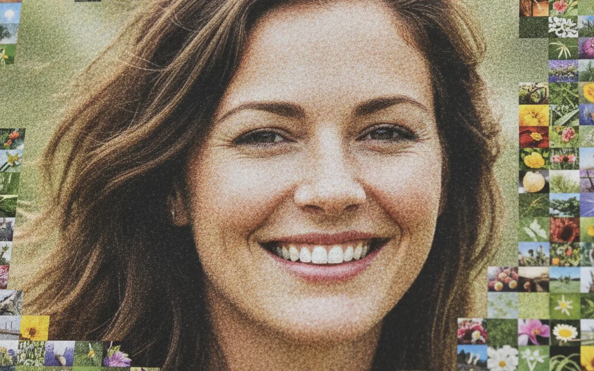
- A large subject. In a portrait, each eye needs several cells to stay recognizable, so crop tight.
A useful check: shrink the target to the size of your grid, for example 60×80 pixels, and look at it. If you can still tell what it is, it will work as a mosaic.
Faces deserve extra care. Viewers forgive a lot in the background, but they notice immediately when the eyes or the mouth are slightly off. If a test build loses the likeness, crop the target tighter so the face covers more cells, or move to a finer grid, rather than adding blending to hide the problem.
Tile Size for Print vs. Screen
The final output decides how big each tile should be in pixels, and how many cells the grid can have.
For Print
Prints are typically produced at around 300 pixels per inch. A 24×36-inch poster at 300 ppi is 7,200×10,800 pixels. With 80 columns, each tile is 90 pixels wide, or about 0.3 inches on paper, which is large enough to recognize a face up close. Fewer, larger tiles make the tiles more readable; more, smaller tiles make the overall image sharper. Viewing distance tips the balance: a print in a hallway can afford a finer grid than one meant to be studied at arm’s length.
For Screen
Screens have far fewer pixels. A 4K display is 3,840 pixels wide, so 80 columns leaves only 48 pixels per tile, which is barely enough to tell what’s in it. For on-screen mosaics, either use a coarser grid of 30 to 50 columns, or export a very large file and present it in a zoomable viewer so people can explore the tiles.
The Bottom Line
A strong mosaic starts with a library sized to the grid, rich in the colors the target needs, cleaned of near-duplicates, and cropped to a consistent shape. Pick a target with bold shapes, set repeat limits you can live with, and size the tiles for how the mosaic will be seen. With that groundwork done, PhotoTile’s matching has the material it needs to produce a picture that holds up at any distance.