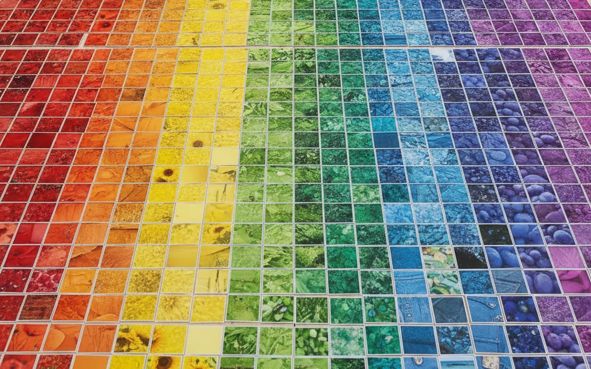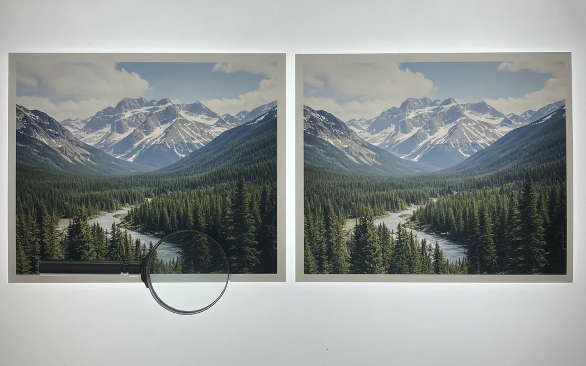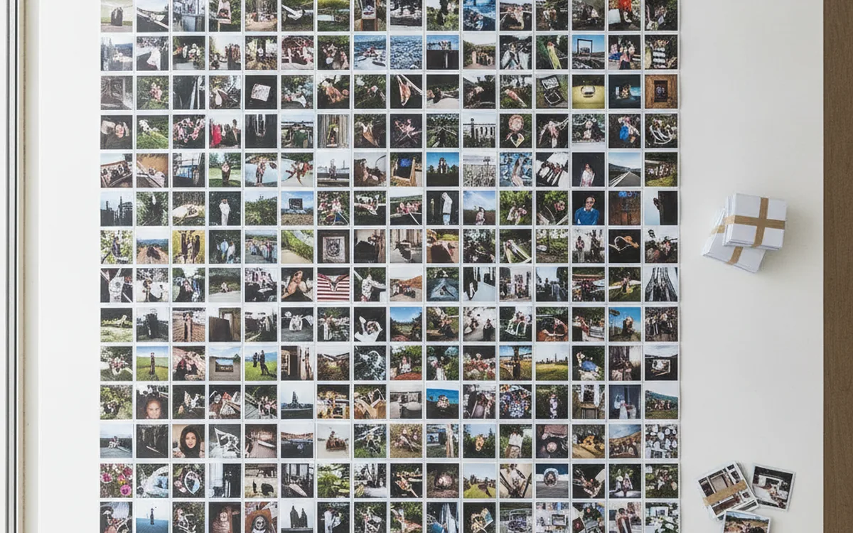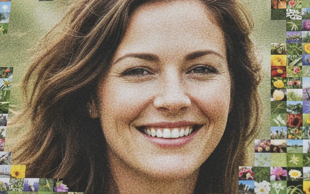
A photo mosaic relies on a simple quirk of perception. From a distance, the eye averages the colors of small details and sees the overall picture; up close, it picks out the individual images the picture is made of. A good mosaic works at both distances: the portrait is recognizable from across the room, and as you step closer, every tile holds up as a photo in its own right.
A handy example to break down: a portrait of Benjamin Franklin assembled in PhotoTile from roughly 1,800 postage stamps. The stamps were drawn from a library of 3,066 images, and the final file measures 4000×4667 px. Below is a step-by-step look at what happens between the source portrait and the finished mosaic.
The Tile Library
The library shapes the quality of a mosaic more than the algorithm does. The software can only pick from what it has. If the library has no dark brown images, the shadows in a portrait will be built from the closest thing it can find, say dark blues, and the face will take on a strange cast.
What Matters in a Library
- Tonal coverage: from near-white to near-black, with the gradations in between.
- The right colors. For a portrait, that means skin tones, browns, and grays; for a seascape, blues and teals.
- Quantity. The more tiles you have, the less often the same ones repeat and the more accurate the matching.
- Consistent shape. Tiles are normalized to the same aspect ratio, so if the library mixes portrait and landscape images, some of the content will be cropped.
Before assembly, each tile is analyzed once: the software computes its average color and stores the result. From then on, matching runs against those values rather than the images themselves, which is why even a library of several thousand images is processed quickly.
Grid and Resolution
Dividing Into Cells
The source image is divided by a grid into rectangular cells, and each cell is later replaced with a single tile. Cell size sets the central trade-off of any mosaic. Large cells keep the tiles recognizable but make the source harder to read; small cells capture facial detail but turn the tiles into colored dots.
In a portrait, the critical areas are the eyes, the line of the mouth, and the outline of the face. If an eye gets only one or two cells, the likeness is lost. That’s why portraits usually get a finer grid than landscapes, where large masses of color (sky, water, a field) remain recognizable even with a coarse grid. The roughly 1,800 cells in the Franklin example give the face enough points to stay a portrait without reducing the stamps to pixels.
Cell Proportions
Each cell should match the proportions of the tiles; otherwise every tile has to be stretched or cropped. Stamps are usually a bit taller than they are wide, so the grid is vertical too. That also explains the uneven dimensions of the final file: the width and height are built from a whole number of tiles with their own proportions.
Final Resolution
The final resolution equals the number of tiles across multiplied by the tile width in pixels, and the same goes for height. At 4000×4667 px and about 1,800 tiles, each stamp is roughly a hundred pixels on a side. That’s enough to zoom in on screen and make out the design and lettering on each stamp.
If the mosaic is headed for print, work backward from the print size and the viewing distance. For a poster people will walk right up to, each tile needs more pixels, or it will look blurry up close. For a screen, or a print viewed from a few steps back, a moderate resolution is enough.
Matching by Color and Brightness
For each cell of the source image, the software computes an average color and searches the library for the tile whose average color is closest. Closeness is measured as the distance between colors: how much the red, green, and blue components differ.
Brightness matters more than hue. The eye is far more sensitive to shifts between light and dark than to shifts in color, so a mosaic with accurate tones and approximate colors reads better than the other way around. You can even build a black-and-white portrait from color tiles, as long as they’re distributed correctly by lightness.
Why Average Color Isn’t Always Enough
Two tiles can share the same average color while one is a flat gray and the other is half black and half white. Along the edge between shadow and light, the second tile fits better, provided its dark half faces the right way. A more careful approach splits both the cell and the tile into several parts and compares them one by one, taking into account where the tile is lighter and where it’s darker.
Repeats and Blending
Limiting Repeats
If you always take the best match, the same tile will repeat many times in a row across uniform areas (the background, a cheek, the forehead). From a distance it’s invisible; up close it looks like a mistake. So a limit is introduced: a tile can’t be used more than a set number of times or placed closer than a set distance to its own copy.
Limiting repeats slightly reduces color accuracy: instead of the best match, the second- or fifth-best gets placed. But the mosaic comes out ahead: the surface feels alive and is more interesting to explore. This is where a large library proves its worth: with 3,066 stamps for 1,800 cells, there’s plenty to choose from without repeating in neighboring positions.
Light Blending
Even with good matching, a tile rarely lines up with its cell exactly. To tighten up the overall image, each tile can be shifted slightly toward the cell’s target color. The key word is “slightly.” The portrait example uses about 2% blending: enough to make the contours of the face a little more confident, but not enough for the stamps to lose their own colors.
Practical tip. Start with minimal blending and increase it only if the portrait doesn’t read from a distance. Heavy tinting makes the image recognizable, but the tiles turn into tinted rectangles, and the mosaic ends up looking like an ordinary photo with a grid laid over it.
Why Stamps Make a Good Portrait
Postage stamps turned out to be a great material for several reasons at once:
- They share a uniform format, so the grid lines up cleanly and almost no cropping is needed.
- Stamps from different countries and decades provide a broad palette: faded browns, deep blues, reds, greens, beiges.
- Many stamps feature portraits themselves, and a dark face on a light field makes a tile with a pronounced light distribution, which is useful along shadow edges.
- White margins and perforations create a natural light grid that keeps the mosaic from blurring into a muddy smear.
There’s a thematic rhyme, too. Franklin was the first Postmaster General of the United States, and his portrait appeared on one of the first American stamps. Building his face out of stamps means constructing the image from the very material he’s tied to.
The Bottom Line
A mosaic comes down to three decisions: which library, which grid, and how strictly to match the tiles. A library rich in tones, a grid fine enough for the key details, a limit on repeats, and restrained blending produce an image that looks equally good from afar and up close.