Almost every image editor asks the same question when you save a JPEG: what quality? Most people pick a number that feels safe, such as 80, 90, or 100, and move on. That works, but understanding what the number does helps you avoid bloated files, visible artifacts, and the slow decay that comes from saving the same photo over and over.
What the Quality Number Actually Does
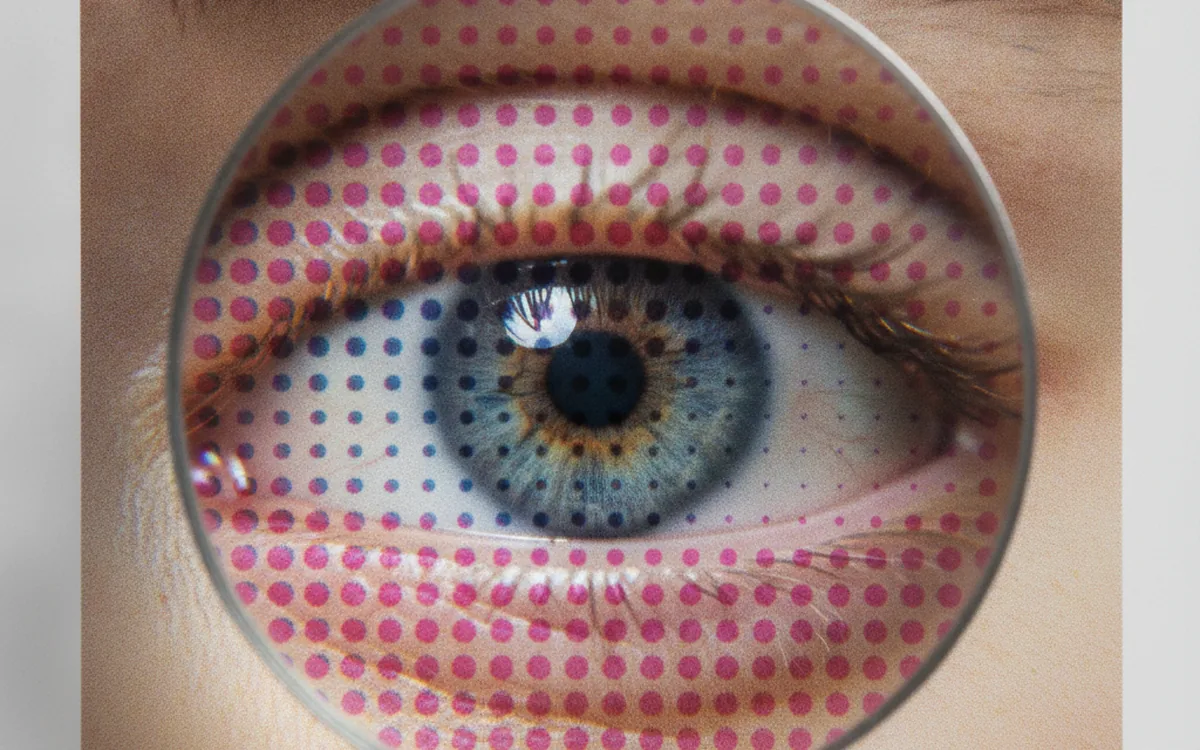
JPEG compression works on small blocks of the image, 8×8 pixels at a time. Each block is converted from pixels into frequencies using a mathematical transform called the discrete cosine transform. Low frequencies describe smooth gradients and overall brightness; high frequencies describe fine detail and sharp edges.
The lossy step comes next. Each frequency is divided by a value from a quantization table and rounded. Larger divisors throw away more precision, and high frequencies get the largest divisors, because the eye is less sensitive to fine detail than to broad tones. The quality setting simply scales those tables: lower quality means larger divisors, more rounding, and a smaller file.
It Isn’t a Percentage
Quality 80 doesn’t mean “80% of the original.” It’s an arbitrary scale, and different programs use different scales. Some use 0 to 100, some use 0 to 12, and two programs set to the same number can produce noticeably different files. Treat the number as a position on a dial, not a measurement, and judge the result with your eyes.
What Low Quality Looks Like
- Blocking: the 8×8 grid becomes visible in smooth areas like skies and skin.
- Ringing: halos and mosquito noise around sharp edges, especially text and line art.
- Banding: gentle gradients break into steps.
Sensible Ranges
For photos on the web, quality in the high 70s to mid 80s is usually indistinguishable from the original at normal viewing size. For files you’ll print or edit later, 90 to 95 is a safe ceiling. Above 95, file size climbs steeply while visible quality barely changes, and quality 100 is still lossy.
The right value also depends on the content. A busy photo of leaves or gravel hides artifacts well and survives lower settings, while a portrait against a smooth studio backdrop or a clear sunset sky shows blocking much sooner. When you set one quality level for a whole batch, test it on the hardest image in the set, not the average one: compare at 100% zoom against the original, step down until you can see a difference, then go back up a notch.
Chroma Subsampling
Before compression, a JPEG encoder converts the image from RGB into one brightness channel and two color channels. Because human vision resolves brightness much more finely than color, the encoder can store the color channels at lower resolution. That’s chroma subsampling, and it’s written as a ratio.
- 4:4:4 keeps full color resolution. Best quality, largest files.
- 4:2:2 halves color resolution horizontally.
- 4:2:0 halves it both horizontally and vertically, storing one color sample for every four pixels. This is the most common setting for photos.
For ordinary photographs, 4:2:0 is nearly invisible and saves a lot of space. It shows its limits on hard color edges: red text on a blue background, thin colored lines in charts, and pixel-precise UI screenshots. There, colors smear across edges and look fuzzy even at high quality. Many encoders choose subsampling automatically based on the quality setting; if yours exposes it, use 4:4:4 for graphics and anything with small colored text.
Practical tip: if a screenshot looks fine in grayscale areas but colored text has blurry fringes, raising the quality won’t help much. Switch subsampling to 4:4:4, or better yet, save the screenshot as PNG.
Generation Loss: Why Re-Saving Hurts
Every time you open a JPEG, edit it, and save it as JPEG again, the encoder quantizes the image once more. Rounding errors accumulate, and artifacts from the previous save become “detail” that the next save tries to preserve. This is generation loss.
Re-saving at identical settings with no edits tends to stabilize after a few rounds. Real workflows are worse: cropping shifts the 8×8 grid so the blocks no longer line up, resizing and color adjustments change every pixel, and a different program uses different tables. Each round costs a little more.
How to Avoid It
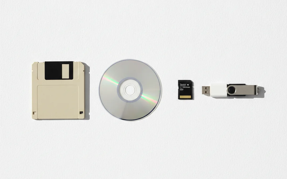
- Keep a master in a lossless format: the camera RAW, a TIFF, or a PNG.
- Do all edits on the master and export JPEG only as the final step.
- For 90-degree rotations, use a lossless JPEG rotation tool. It rearranges the compressed blocks without re-encoding, as long as the dimensions fit the block grid.
- When you need copies at several sizes, generate each one from the master, not from another JPEG.
That last step is where batch processing earns its keep. A PhotoBatch script can read a folder of masters and write web, email, and print versions with their own sizes and quality settings in one pass, so no JPEG is ever made from another JPEG.
Progressive vs. Baseline JPEG
A baseline JPEG stores the image top to bottom, so on a slow connection it loads in strips. A progressive JPEG stores several passes of increasing detail, so a blurry version of the whole image appears first and sharpens as more data arrives.
Image quality is identical; only the order of the data changes. For photos larger than a few kilobytes, progressive files are often slightly smaller too. The trade-offs are minor: decoding takes a bit more memory and processing, and some very old or embedded software only reads baseline files. For the web, progressive is a good default.
Metadata is another hidden cost. Camera EXIF data, embedded thumbnails, and color profiles can add tens of kilobytes to every file. For web copies, strip what you don’t need, but keep or convert to an sRGB profile; otherwise colors may shift in viewers that guess the color space.
When to Choose PNG, WebP, or AVIF Instead
JPEG is built for continuous-tone photographs. For other kinds of images, or when you need features JPEG lacks, another format is the better tool.
PNG
PNG is lossless and supports full transparency. Use it for screenshots, logos, diagrams, and anything with text or flat color areas, where JPEG produces ringing and PNG produces small, crisp files. For photos, PNG files are much larger than a good JPEG with no visible benefit.
WebP
WebP offers both lossy and lossless modes, plus transparency and animation. At similar visual quality, lossy WebP is typically smaller than JPEG. Every current major browser supports it, which makes it a practical default for web images. It’s less suited to archives because support in older desktop software is uneven.
AVIF
AVIF usually compresses even better than WebP, holds up well at very low file sizes, and supports 10- and 12-bit color and HDR. Encoding is slow, and maximum image dimensions per frame are limited, so very large files are split internally. It’s an excellent web delivery format when your pipeline and audience support it.
A Quick Rule of Thumb
- Photo for the web: WebP or AVIF, with JPEG as a fallback.
- Photo for sharing, email, or print shops: JPEG, quality 85 to 95.
- Screenshot, logo, chart, or anything needing transparency: PNG, or lossless WebP on the web.
- Archive master: RAW or TIFF, never a re-saved JPEG.
The Bottom Line
The JPEG quality number scales how aggressively fine detail is rounded away, and it means different things in different programs. Pick quality by eye, use 4:4:4 subsampling for graphics, export JPEG once from a lossless master, prefer progressive for the web, and reach for PNG, WebP, or AVIF when the image or the destination calls for it.